
Summer Exterior Refresh choosing eye-catching accent colors for your home Facade
Looking for a summer exterior refresh? Summer is the perfect time to give the exterior of your home a fresh and vibrant look. One of the most effective ways to achieve this is by choosing eye-catching accent colors for your home’s facade. By carefully selecting the right colors, you can enhance the curb appeal of your property and create a welcoming and visually appealing atmosphere.
In this blog post, we will provide you with 10 expert tips to help you choose the perfect accent colors for your home’s exterior, whether you’re painting in Burnaby or painting in Coquitlam.
Experts have suggested the following proven tips for choosing eye-catching accent colors for your home’s facade for a nice summer exterior refresh.
Why Choose AZ Painting For Your Project?
Warranty
Our three years of industry-leading warranty is included with every project we perform. Additionally, the manufacture of the material also incudes their warranty.
30+ Years Painting Experience
Our projects are completed with our experienced in-house employees and we bring 30+ years of experience to every project performed by AZ Painting.
Insured, Bonded, Licensed
We are a licensed, insured, and bonded painting company delivering quality workmanship. Our A+ Rating with Better Business Bureau shows our integrity.
10 Proven Tips For Choosing Eye-catching Accent Colors For A Summer Exterior Refresh
Consider the Architectural Style
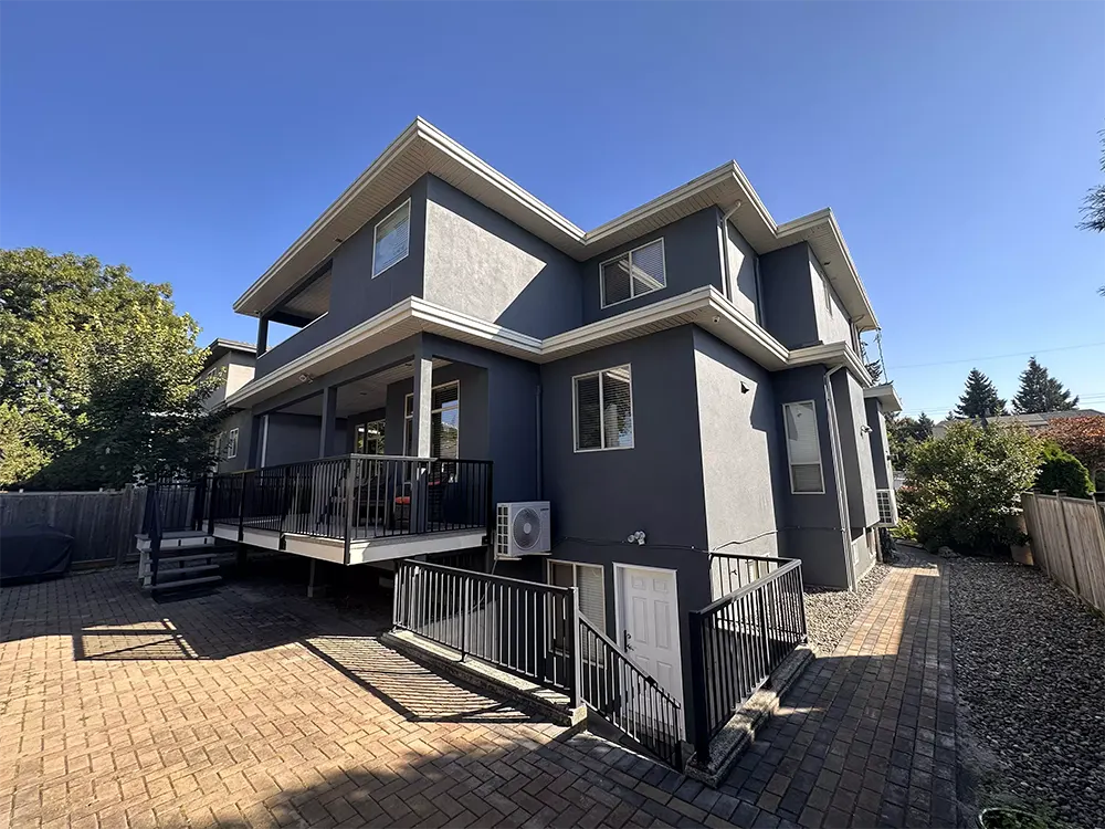
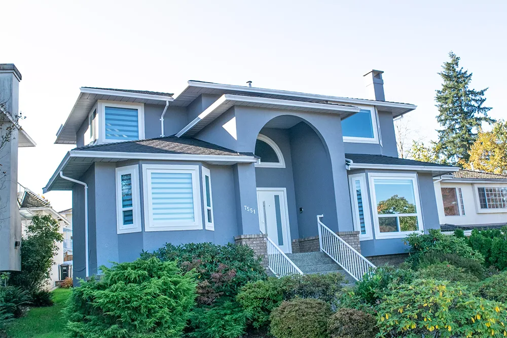
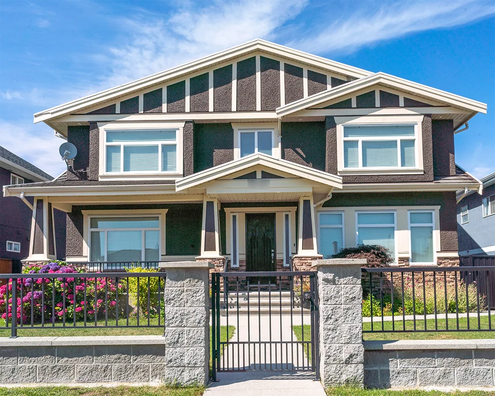
Before diving into color choices, take a moment to consider the architectural style of your home. Each architectural style has its characteristic color palettes that can guide your decision-making process. For instance, if you have a modern home with clean lines and a minimalist design, you might benefit from bold and contrasting colors that add a contemporary touch. On the other hand, if you own a traditional home with intricate details and classic elements, you could be better served by more muted and timeless hues.
Assess the Surrounding Environment
Observe the natural surroundings of your home, including the landscape, neighboring buildings, and the overall neighborhood vibe. Choosing accent colors that harmonize with the environment can create a cohesive and pleasing look for your home. For instance, if your property is nestled amidst lush greenery, consider earthy tones that complement nature’s palette. If your neighborhood boasts vibrant and diverse facades, a pop of color can make your home stand out as a statement piece.
Pay Attention to Color Psychology
For a summer exterior refresh, remember that colors evoke emotions and set the mood for your home. When choosing accent colors, consider the psychological impact of different hues. Cool tones like blue and green can promote a sense of calmness and relaxation, making them ideal for homes seeking a serene ambiance. In contrast, warm hues like red and orange create a more energetic and vibrant atmosphere, perfect for homes looking to exude a lively and welcoming vibe.
Summer Exterior Refresh Tip: Take Inspiration from Nature
Nature can provide an excellent source of inspiration for accent colors. Look around your area for inspiration from the local flora, such as blooming flowers, lush greenery, or sandy beaches. Incorporating these natural hues into your color scheme can create a harmonious and refreshing appearance. For example, a coastal-inspired color palette featuring shades of blues and greens can evoke a sense of tranquility, while a desert-inspired palette with warm tones like ochre and terracotta can add warmth and character for a summer exterior refresh.
Summer Exterior Refresh Tip: Test the Colors in Natural Lighting
Colors can appear drastically different depending on the lighting conditions. To avoid any regrets after the painting is done, test your chosen accent colors in natural lighting. Take paint swatches and place them on different parts of your home’s facade at various times of the day. This will help you gauge how the colors interact with sunlight and shadow, ensuring the desired effect throughout the day.
Summer Exterior Refresh Tip: Consider the Existing Color Palette
Take into account the existing colors of your home’s exterior, such as the roof, siding, and other permanent features. Select accent colors that complement these existing elements rather than clash with them. A well-coordinated color palette will create a cohesive and harmonious overall look. For example, if your roof has red undertones, consider warm accent colors that complement this base, like golden yellows or rusty oranges.
Did you know our reputation holds a A+ with Better Business Buraeu
Use the 60-30-10 Rule
For a great summer exterior refresh and to achieve a balanced and visually appealing composition, follow the 60-30-10 rule. This rule involves choosing a dominant color that covers about 60% of the exterior, a secondary color for 30% coverage, and an accent color for the remaining 10%. This proportion ensures a well-balanced and visually engaging color scheme. For instance, if your dominant color is a neutral shade, your secondary color could be a slightly darker or lighter variation of the same hue, while the accent color could be a bold complementary shade.
Keep Maintenance in Mind
For a nice summer exterior refresh. Consider the maintenance required for different colors and finishes. Darker colors may show dirt and require more frequent cleaning, while lighter shades may be more forgiving. Additionally, certain finishes may require more upkeep than others. Choose colors and finishes that align with your maintenance preferences and capabilities. Matte finishes can be more forgiving in terms of dirt and imperfections, while glossier finishes can reflect more light, adding depth to the overall appearance.
Seek Professional Advice
If you’re unsure about color choices or need expert guidance, don’t hesitate to consult with a professional painting contractor. They can provide valuable insights, recommend suitable color combinations, and help you achieve the desired look for your home’s exterior. Professional painters in Burnaby or Coquitlam can also offer their local expertise to ensure your color choices align with the regional aesthetic, taking into consideration the prevalent color trends in the area.

Revamp Your Outdoor Oasis: Easy and Creative Ideas to Refresh Your Out-door Spaces
Revitalize your outdoor space with nature’s power. Grow vegetables, fruits, veggies, and flowers. Unwind, play, and explore a colorful oasis complete with seating and a grill. It can be a haven of peace and a place to call home.
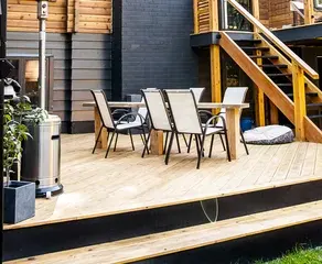
Outdoor Porch Decor
If you’re searching for budget-friendly methods to enhance your home, there are plenty of creative ideas to consider. One idea is to incorporate colorful accents such as outdoor rugs or throw pillows to add charm to your patio furniture. For a truly natural feel, consider adding potted plants or a hanging garden. You can also create a DIY outdoor bar by repurposing old furniture, adding some bar stools, and using your creativity. Another easy-to-execute idea is to incorporate outdoor lights or lanterns to create a warm and welcoming environment. For those with a bigger budget, installing a fire pit or an outdoor grill could be a great addition for cooking and entertaining purposes. With some resourcefulness and elbow grease, you can turn your outdoor haven into a functional area for relaxation and socializing.